What’s the equation for love?
It’s probably very complicated, very simple, or does not exist, depending on who you ask. But there are a plethora of math equations for the universally recognized symbol for love ❤️
In the word salad that is #datascience, #machinelearning, #ai one of the things that we try to do is “dimensionality reduction”. And it gets complicated, kind of like love.
One of the techniques often cited for dimensionality reduction — trying to find a handful of explanatory factors (or combinations of factors) for the behavior of a system from the zillions of factors that we may have — is something called “Principal Component Analysis” (PCA).
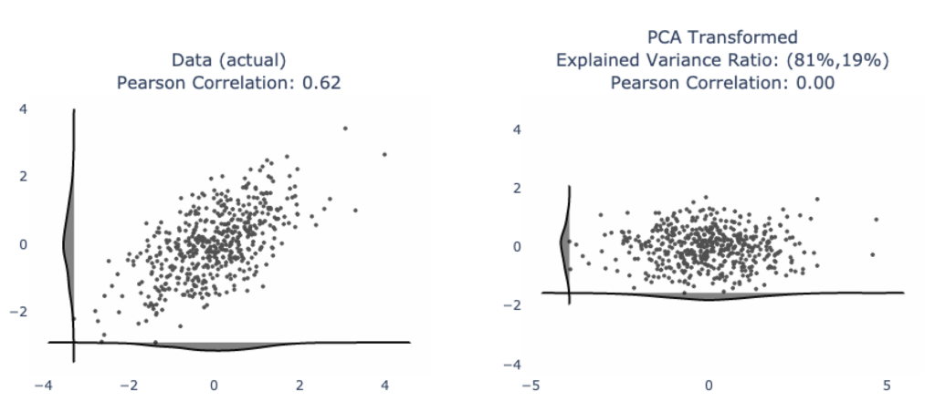
We’ll often see nice looking examples like this one where our data has a clearly visual linear trend (left) and after applying PCA, we have the data neatly organized into its two principal components (right). From here, you are given statistics like “explained variance ratio” to show that 81% of the variability in the data can be explained by the first principal component (horizontal axis on the right plot) and 19% of the variability is the second principal component.

Furthermore, the principal components are uncorrelated. This is very nice for data modeling and data analysis because you have to worry less about duplicative variables. Kind of like if you were looking at home prices in a given neighborhood, the number of bedrooms in a house is likely positively correlated with the number of bathrooms. It would be unusual for a 5 bedroom home to have only 1 bathroom. And it would be unusual for a 2 bedroom home to have 3 bathrooms. So from a data modeling standpoint, you don’t really have “two variables”, you may have more like “one and a half variables”, loosely speaking.
And while you may also have heard data scientists yell “correlation does not imply causation!”, the probability that there is causation between two variables given that there is correlation between them is likely positive enough for us to assume causation.
So, from a modeling standpoint, people like to treat the principal components as independent axes because the correlation between them is zero.
Love may be unconditional for some. But for using PCA-transformed data, there are conditions — one of which is: there ought to be a linear trend in the data, like from the image above. And really, if we did truly capture the behavior of our system, we should be able to generate synthetic data from it, like below. Notice that the image on the far right (synthetic data), visually at least, looks like the data on the left (our original, actual data). We can apply statistical tests to validate this. I’ll write a separate article about this later.

If we, thoughtlessly, apply PCA to our data, we run the risk of getting crazy outputs.
Here are a few examples:
The classic half moon data — notice how all that has happened is a small rotation of the axes; and even though the correlation is zero, visually there is a strong pattern in the data. To boot, the synthetic data generated from resampling PCA output does not give back data that looks like our original distribution, even though they have roughly the same correlation.

Another classic: “X” shaped data — maybe if you squint, the synthetic reconstruction has some characteristics, but it’s doubtful this will pass a statistical test.

You may cry foul and say “real world data doesn’t look like this”. Here’s exponentially distributed data. User behaviors have this kind of a shape, though sometimes more extreme. PCA is a mess!

Dimensionality reduction, like love, is not cookie cutter.

Reach out, if you need help with your data science, machine learning, AI efforts!
