If you’ve taken a business stats class or the equivalent, you might have been given qualitative labels like “0.3 correlation is weak”, “0.5 correlation is modest”, and “0.7 correlation is strong”.
What I’ve found over the years between teaching these stats courses and also working in industry across all business segments is that there is a disconnect between the correlation value, what that data looks like, and what a line of best fit can do.
The qualitative labels at the specified cutoffs are indeed good names. However, the non-practitioner, end user who relies on mathematical data fitting tends to make business decisions (aka stakeholder) tends to get disenchanted with the model efficacy because of a perception of what weak, modest, and strong mean and what the numerical correlation value means.
The lay understanding of “correlation of 0.9” is “90% of the data is related” or “there is a 90% correlation”. Both of these rephrasings are incorrect. Unfortunately, we get a compounding effect in that a model that is fit to, say, “correlation of 0.9” data should then be “correct” 90% of the time. To rub more salt into this wound, the word “correlation” itself is subject to multiple colloquial understandings that are divorced from the technical meaning.
When people say “correlation” in regular, everyday speech, they mean “association”. Data organized in a circle, is colloquially, correlated, but technically, the Pearson correlation is zero, meaning no correlation. It is possible to come up with a measure of how circular two-dimensional data is. However, the general standard is that when we discuss “correlation” we mean how linear is the data.
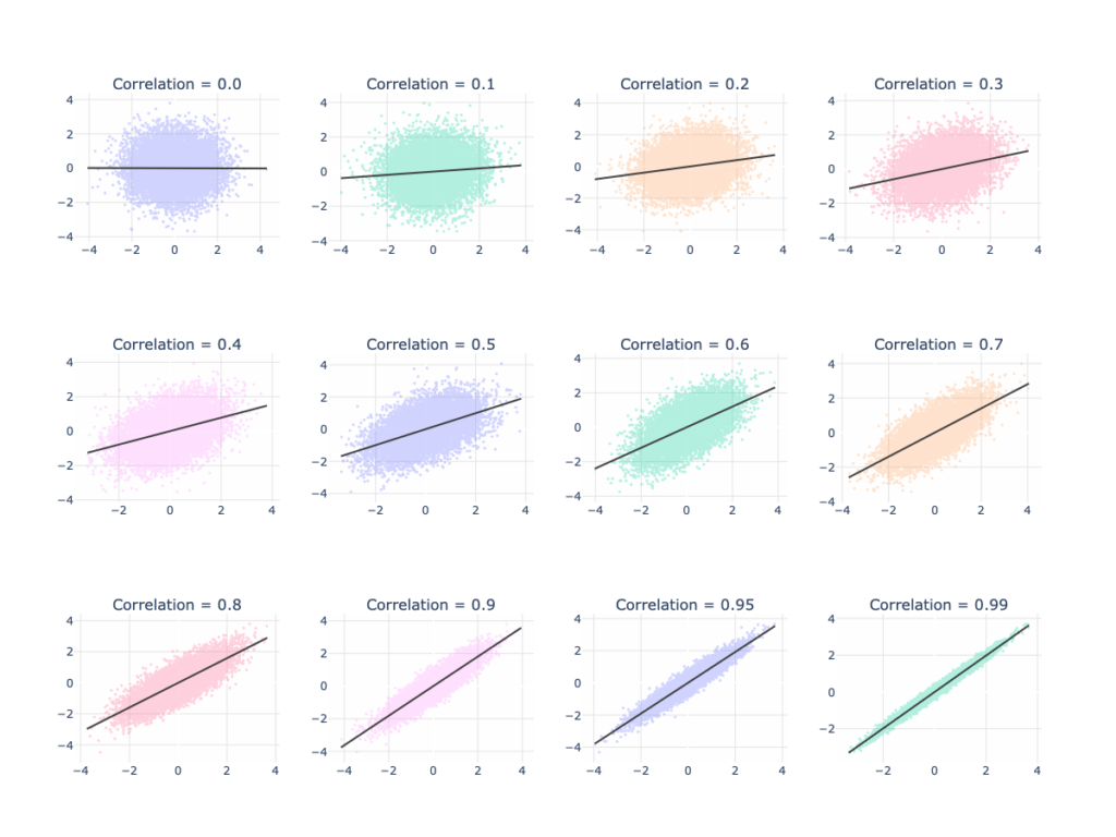
When working with data scientists and data analysts, it helps to know that there is a difference between the familiar use of “correlation” vs the technical use. If in your data, you see a correlation of 0.6, know that while this still means “pretty good linear relationship”, there remains reasonable variation in the data.
Perfect prediction requires a correlation of 1. Even at a correlation of 0.99 and fitting a line to this type of data, there is basically a 0% chance that the model will precisely give the observed output for a given input. However, what you can expect from 0.99 correlation vs 0.6 correlation is that the model error will be lower for the higher correlation.
The graph below shows data on several x-y charts for varying levels of correlation. You can see that data with a correlation of zero is best fit by a horizontal line. As correlation increases, the fitted line and data show more of a trend (higher values on the horizontal axis are observed with higher values on the vertical axis). You will also notice that the data becomes more narrow. It just may not be getting as narrow as you would have expected, especially for a correlation of 0.99!

The graphs above are from idealized data. Real data tends to have more pathologies (outliers being the biggest culprit). It is possible to create two completely different looking data sets with exactly the same correlation (and other metrics!). For the curious reader, I direct you to Anscombe’s Quartet as a starting point for a cautionary tale about the perils of relying solely on summary statistics.
If you find yourself discussing correlations with your data scientists or data analysts, or vice versa if you are the data magician discussing with your stakeholder, make sure that both parties are aligned on the words used. From there you can have a more meaningful conversation about how to understand and interpret both the data and its modeling.