Data and data modeling can come in many forms. And they don’t always require data! Well, not in the traditional sense, at least. What on Earth is the “non traditional sense”?
There are plenty of situations where we do not have the luxury of A/B testing nor are we able to find comparables “in the market” or in the past. We can try to source hard data, but perhaps it doesn’t come easily or it doesn’t exist or it’s not complete enough. Sometimes we are just left with the opinions of people in-the-know and we have to make a call. These opinions are our “non traditional” data.
I’ll use a ridiculous question to demonstrate how to quantify expert opinions and then we can reframe it to actual business questions.
Will I Make Burnt Toast? Experts Weigh In.
Manan is going to make toast. What’s your low and high estimate for the chances that Manan will make burnt toast? Give an X and a Y to fit this sentence: “I think there’s somewhere between an X% to Y% chance that Manan will make burnt toast.”
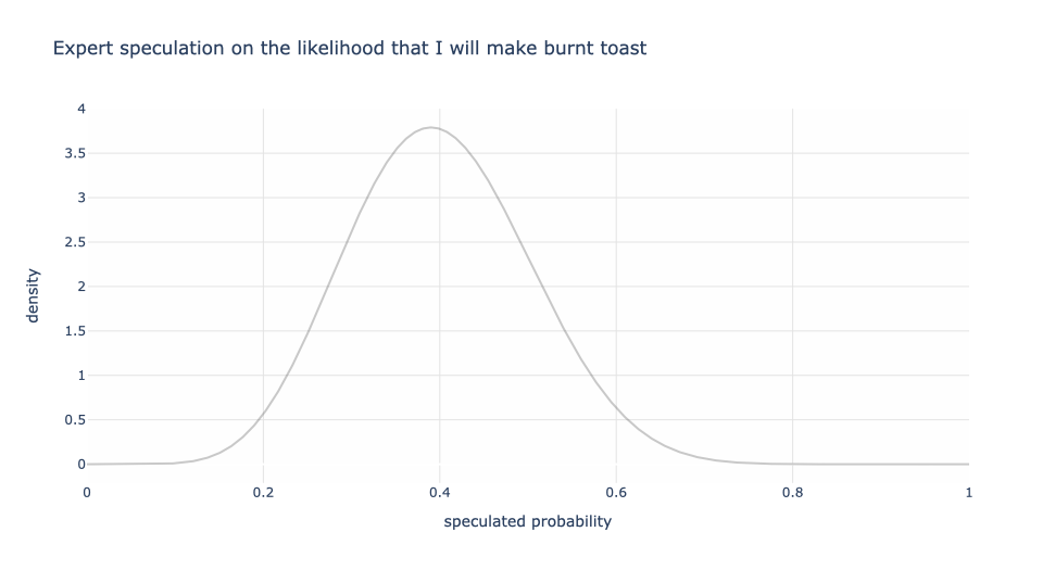
Who gets asked this question? That’s up to whoever is doing the study. I asked my wife and her response was “20% to 60%”. A friend chimed in, too. Their response was “20% to 30%” — quite a charitable fellow!
What can we do with this? One approach might be to simply report the ranges and call it a night. Another might be to compute midpoints and say that experts believe there is a 25% to 40% chance that Manan burns toast. Or still, take the lowest and highest of all the ranges and report that as the blended expert sentiment. This could work fine, but we’re losing out on an opportunity to learn more about expert sentiment.
Let’s explore! First consider my wife’s speculation of 20% to 60%. The graph below models this where the midpoint is 40% with the 20% and 60% making up the tails of the distribution. The vertical axis, loosely speaking, is the weight for each probability. So even though my wife said 20% to 60%, under some (reasonable) assumptions of symmetry and shape of the distribution, 40% has the most weight and the other values gradually having lower weight. We could consider other shapes, like a rectangle or a triangle as examples, rather than a bell-shaped kind of curve. That’s up to us and dependent on the problem. But let’s stick with this for this discussion.
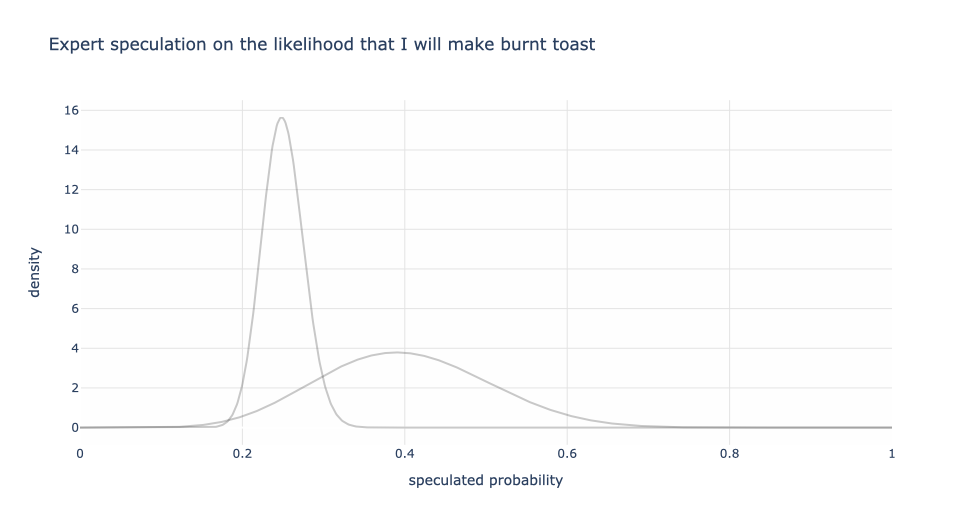
Next, let’s superimpose my friend’s speculation of 20% to 30%. Notice that since my friend has a narrower range, there’s more conviction (higher weight) in the values in my friend’s band than my wife’s, but a fast drop off outside of 20% and 30%.
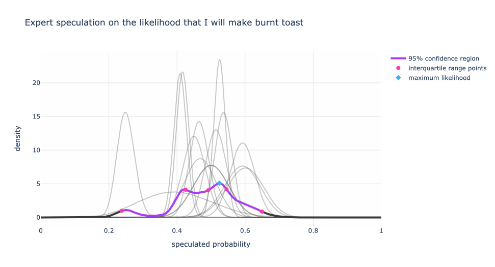
Now how do we combine these two speculations into a single expert distribution? If we assume that both experts’ opinions are equally valid, then we get the graph below where the black and purple curve is the single expert distribution. The purple portion of that curve can be thought of the 95% confidence range. The red dots are the 2.5%, 25%, 50%, 75%, 97.5% levels. And the highest weighted probability is the blue diamond at about ~25%.
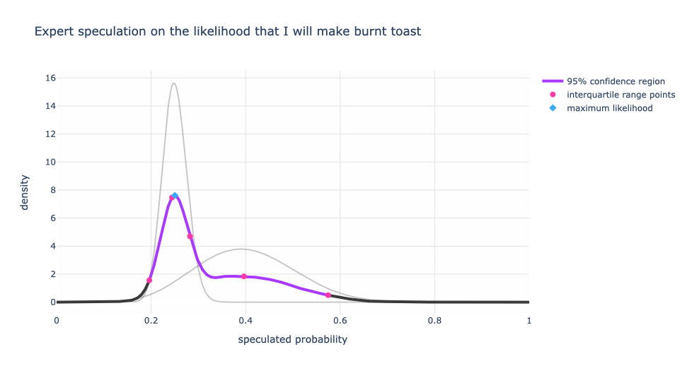
This tells us that given both experts’ speculations, the highest weighted probability that I will make burnt toast is around 25% within a range of 19% to 58%. If you are wondering why the “average” of the experts’ opinion isn’t 32.5% (the average of 40% (wife) and 25% (friend)), it’s because both my wife and friend don’t have a single number in mind. They have an inferred range with different weights for the probabilities. This means that the 25% is getting the most weight between the two individuals than other values.
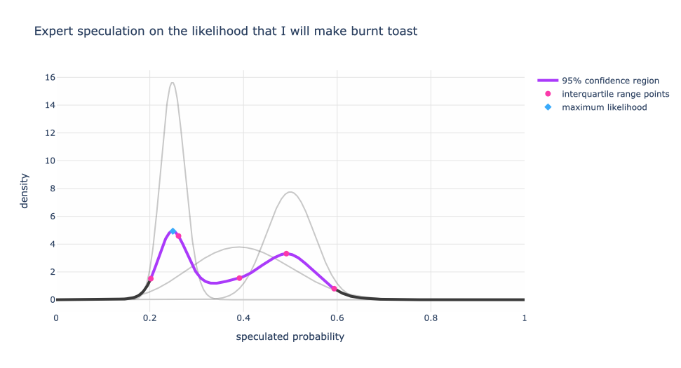
Now let’s add another friend’s speculation of 40% to 60%. If you’re keep tracking, wife: 20% to 60%, friend #1: 20% to 30%, friend #2 40% to 60%. The second friend has a smaller range of speculation than my wife but larger than the first friend. So the conviction of friend #1 is still the dominant view, but there are now two distinct peaks in the blended distribution. This distribution is now “bimodal” and starts to indicate two speculation regimes.
Now let’s add a few more speculations (synthetically generated for illustration, not actual people — really I’m not this bad at making toast!) that were less than charitable on my ability to make unburnt toast. These speculations were in the realm of 40% to 60% with different levels of certainty.
What do we notice?
Now, the single expert with a speculation range between 20% to 30% has less influence on the blended expert distribution.
Also, we have multiple peaks! We can argue that there are three different speculation regimes. The dominant view is around 52% (the blue diamond) and the other two are at 42.5% and 24%. One could argue that the 52% and 42.5% are equally strong views, but still different regimes.
Applications To Product / Brand Research or Consensus Measurement
For product / brand research, we like to ask “how likely are you to recommend / use this product / feature?” with answer choices on a Likert scale. We can devise an inference methodology similar to what I discussed in this article to extract preference regimes, but it requires a few extra assumptions. Or if we tweak the way we ask our questions, we could get the best of both worlds by capturing both a quantitative sentiment and user preference. When further cut on user demographics, we might even find persona regimes.
We can take this toast burning example and instead suppose that we wanted to get a handle on “the probability that the US will default on its debt by July 2023” by asking relevant experts. Then there is some interesting follow up on why there are multiple speculation regimes. Does one group have more information than the other? Is there a political divide that could be causing this? In current events kind of scenarios it is normal for expert sentiment to change as more information comes in.
Capture Uncertainty, Not Just A Single Number
One of the lessons is that it’s important to gauge expert conviction. A single value like “40%” deprives us of measures of uncertainty, since 20% to 60% is centered at 40% as is 30% to 50%. The latter has greater conviction than the former. As we poll more experts knowing their uncertainty levels helps with understanding the overall speculation regime.
The burnt toast example helps us to understand if there is a single view or multiple views and to what degree those views are valid.
In case you were wondering, here’s what the composite expert distribution looks like if we assume equal weighting for the range that the expert gives. In other words, when the expert says “20% to 30%” they are equally sure about the 20% as they are about the 30% and anything in between. But all values outside of that range have a weight of zero.
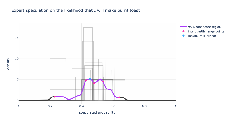
We still have three peaks, but a slightly different flavor. Qualitatively not much has changed between the bell-curve style assumption and the rectangular assumption for the expert’s belief. The rectangular assumption is the less opinionated of the two.
There’s a lot more we can do from here. We might have assigned weights on the experts in advance and gotten a new distribution. If we had used this as a test (where we knew the truth) to prequalify experts, then maybe we can remove the 20% to 30% expert and not seek their opinion — or maybe the majority are not in the know and the 20% to 30% expert is the true expert. We could follow up with the experts to understand more deeply about the roots of their sentiment. Maybe the different speculations were a consequence of when the question was asked.
Remember, capture uncertainty, not just a single number.
Reaching Out
I hope you enjoyed this and if you have questions, let’s connect and shoot me a DM. If you want to understand your users more closely with your product / brand research initiatives and want deeper data science treatments of your qualitative research, I would love to help. Let’s work together.