This post is part of the ppmmc series. Please make sure to have read the previous posts in the ppmmc series so that the context is understood.
In Tuesday’s post (7/2) we got our big toe a little wet when we did an informal hypothesis test for our simulated return against the theoretical return. Today we’ll step back a bit and look at a picture to gain some intuition.
We will go away from our Markov pinball game and consider a simpler example first. Let’s take two, six-sided die. We’ll roll them and take the sum of the sides facing up. Now, we can show pretty easily that on, average, the sum will be seven. The full distribution is as follows:
| \(2,12\) | \(\frac{1}{36}\) |
| \(3,11\) | \(\frac{2}{36}\) |
| \(4,10\) | \(\frac{3}{36}\) |
| \(5,9\) | \(\frac{4}{36}\) |
| \(6,8\) | \(\frac{5}{36}\) |
| \(7\) | \(\frac{6}{36}\) |
Now, to gain some intuition on what happens when we start to take arithmetic averages, we will run simulations! We will call one trial as a set of 100 rolls. For each trial we will record the average of the sum of the two dice. As a sample example, if one trial were five rolls and we observed \(4, 7, 10, 8, 9\), then the average for that trial would be \(\frac{38}{5} = 7.6\). Thus, for a set of 100 rolls, we would add all the sums together and divide by one hundred to obtain the average.
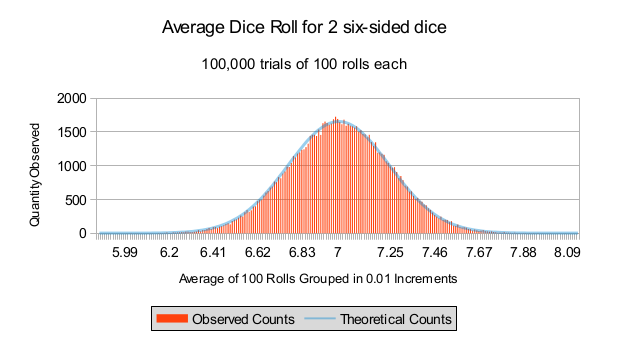
Now, what we want to do is understand what the distribution of the average looks like. To that end, instead of conducting one trial of 100 rolls, we’ll conduct 100000 trials of 100 rolls. The result of this is since in the picture below. Each vertical bar represents the frequency count for averages grouped in increments of 0.01. In other words, we count the number of averages observed in \([5.99, 6.00)\) (note the left bracket and the right parenthesis), for our first group. Our second group is \([6.00, 6.01)\) and so on for the remainder of the groups. The blue curve represents our theoretical fit.
So, what we want to explore is why is the theoretical fit so “nice”? Also, how can we use the theoretical fit? What good is it?
For now, we recommend that you try the following:
- Run simulations like we did for this exercise.
- Group the results into intervals of width 0.01 and build a histogram of the results. In the next few exercises we’ll show how the theoretical fit is made.
Vary the number of samples used per trial. In other words, keep the trials at 100000, but see what happens when the number of rolls per trial is reduced to 50, to 10; or increased to 200 or 1000. What happens to the difference between the smallest value observed and the largest value observed? Why?
Don’t hesitate to get in touch if you have questions or would like more information about setting up a workshop or training in your school.