A quintessential question a product owner has is “given a user’s history (purchasing behavior, interactions with the product, tenure, demographic information, etc.) what is the probability that they will do X?” Where X could be anything from convert into a paying user, upgrade to a higher subscription tier, buy a package add-on, leave the platform altogether, create more content, and so on.
More often than not the product owner has either strong convictions or strong anecdotal evidence of directional relationships — for example, “higher engagement means higher retention”.
The path to quantitative modeling of user behavior from strong belief / anecdotal evidence is a treacherous one often leading to abandonment of data-centric approaches to decision making and product development and instead favoring intuition, guesswork, and anecdotes. And while direct user research (surveys, interviews, etc.) is important, it is also expensive and subject to opt-in bias.
A root cause for product teams going light (i.e., bureaucracy analytics) or outright abandoning product analytics is a belief about what a “relationship” means quantitatively. In a previous article, I showed what different levels of correlation translate to visually.
The reality is directional relationships often don’t translate into strong quantitative ones with high predictive power at the individual level. Yet a qualitative statement like “higher engagement means higher retention” is imagined to have very high correlation like in the image below.
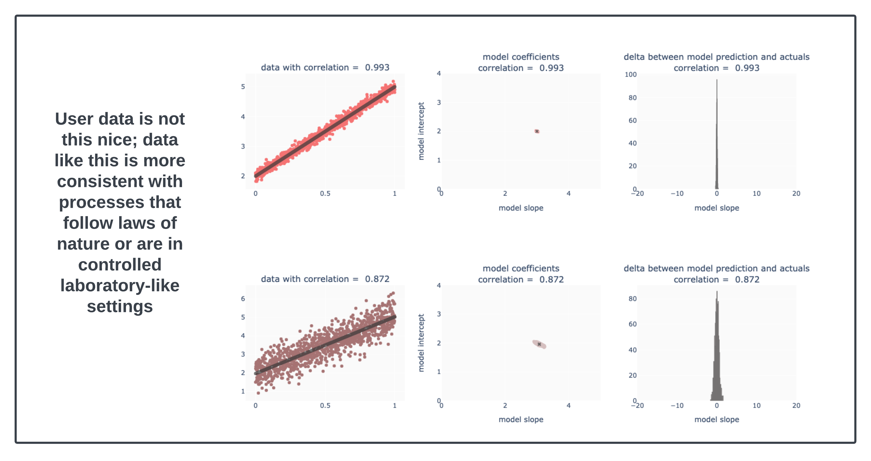
In the image above, the relationships are very strong (correlation of 0.993 and correlation of 0.872). At those levels, the variability in the underlying explanatory model is small and in a way, we can treat this as “law”.
The empirical truth is that user generated data is often not so nicely behaved. In fact, this next image is idealized “weak correlation” data.
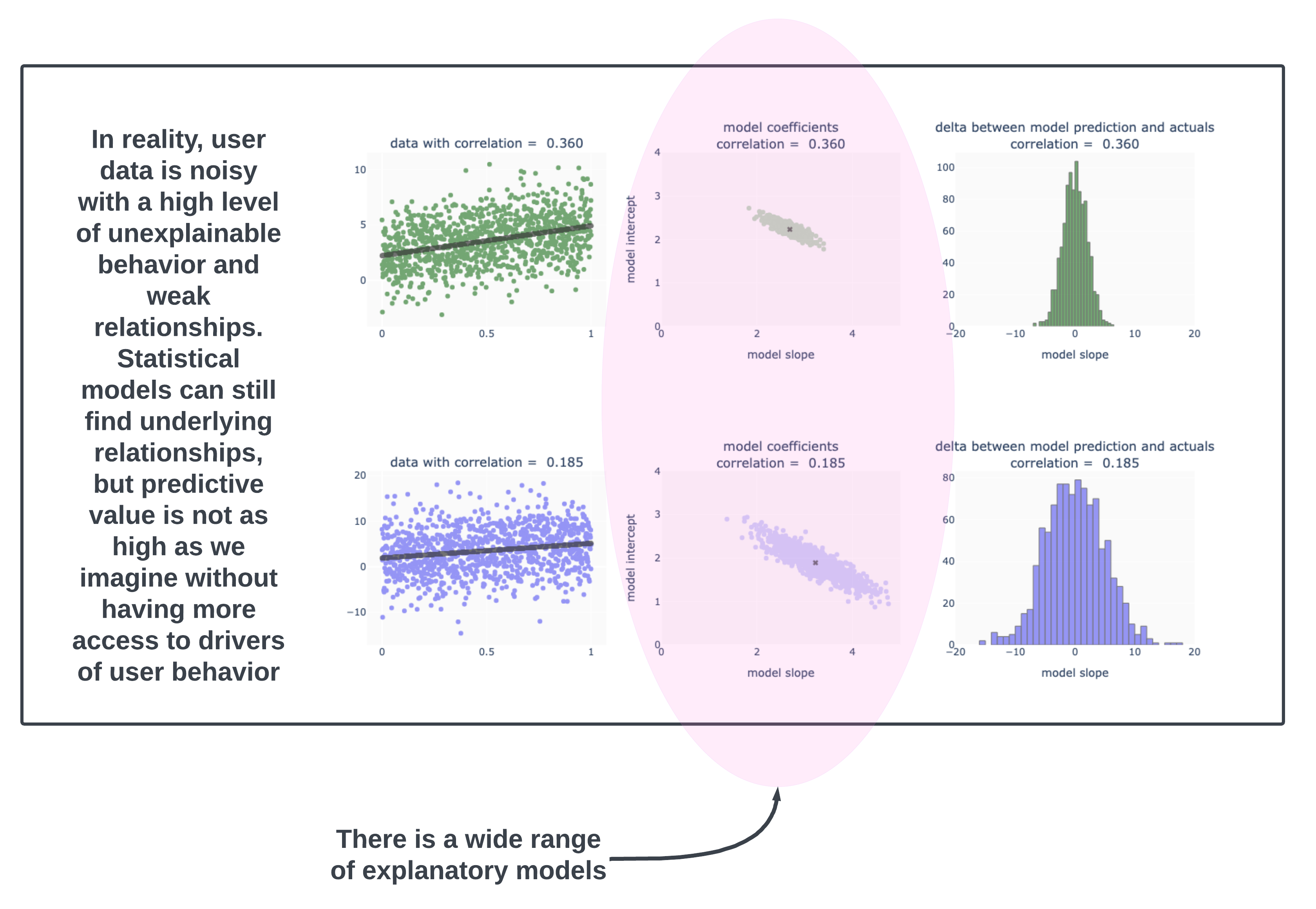
Actual real data would have head-scratching outliers [users are predictably unpredictable in how extreme they’ll get], skewed distributions [Pareto style distributions], inconsistent behavior [why did the user leave when they were clearly engaged with the product??], mixed cohorts [though when doing an analysis we solve for this by examining behavior by cohort], and so on.
Here is an example of count of users by their engagement level. Notice that the bulk of users have engagement levels between 0 and 5. Working with aggregate statistics on data like this is going to be hassle because the skew will dominate in the aggregation.
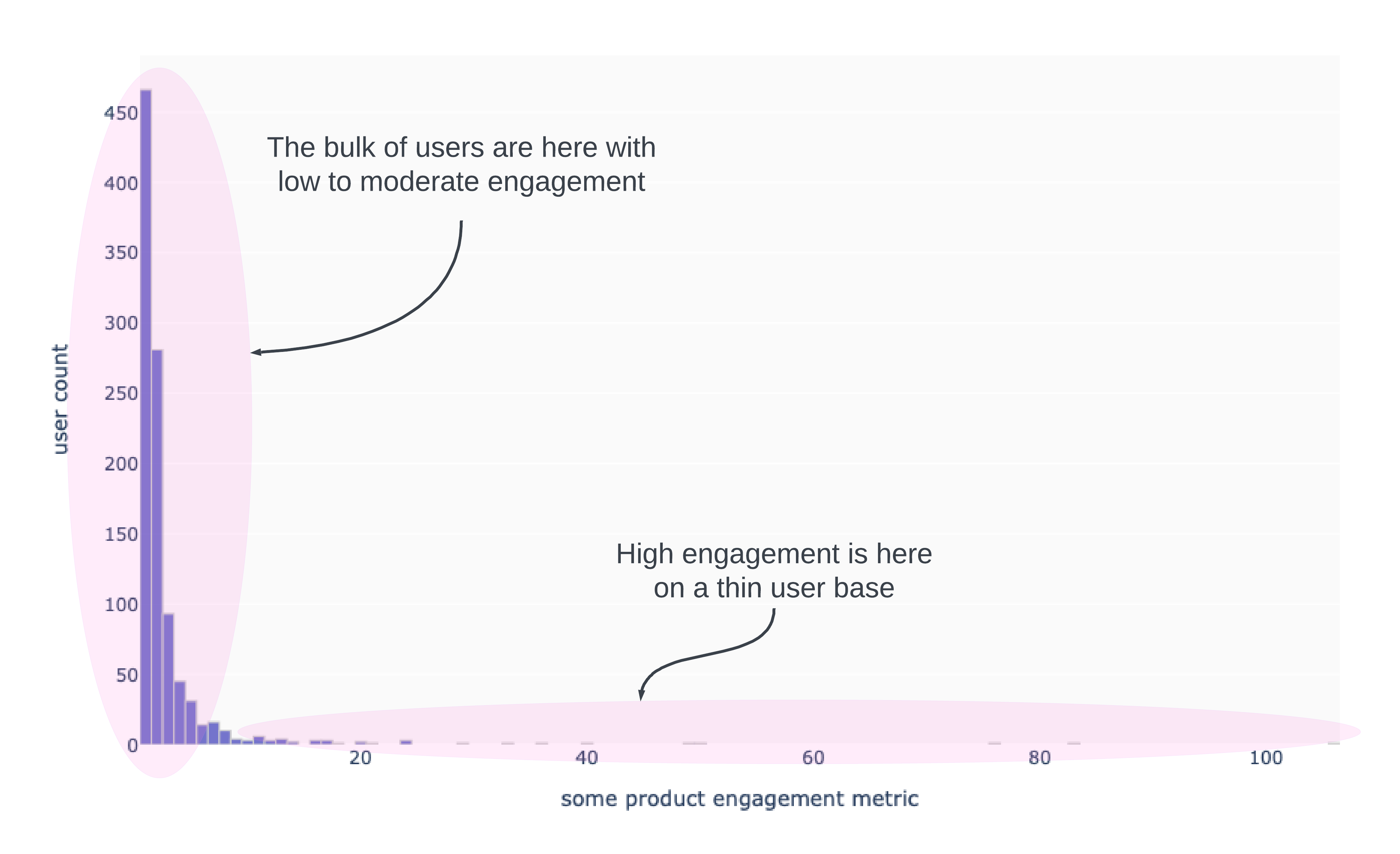
The skew makes statements like “on average … blah blah blah” misleading. Working with the median is hopeless, since moving the median will be a task worthy of Hercules [remember medians are robust to outliers!].
We have to develop a habit of expressing our statements in ranges. Question: “At what engagement level does user retention exceed 50%?” Take a look at the chart below based on the engagement data above. I layered in whether or not a user retained and then accounted for uncertainty by a technique called “bootstrapping”. The blue dots are users aligned for their retention status. The red line is a fitted retention curve based on the data available, which in effect, says “higher engagement translates to higher retention”. The light gray lines account for uncertainty in the measurement, but still give the same qualitative relationship.
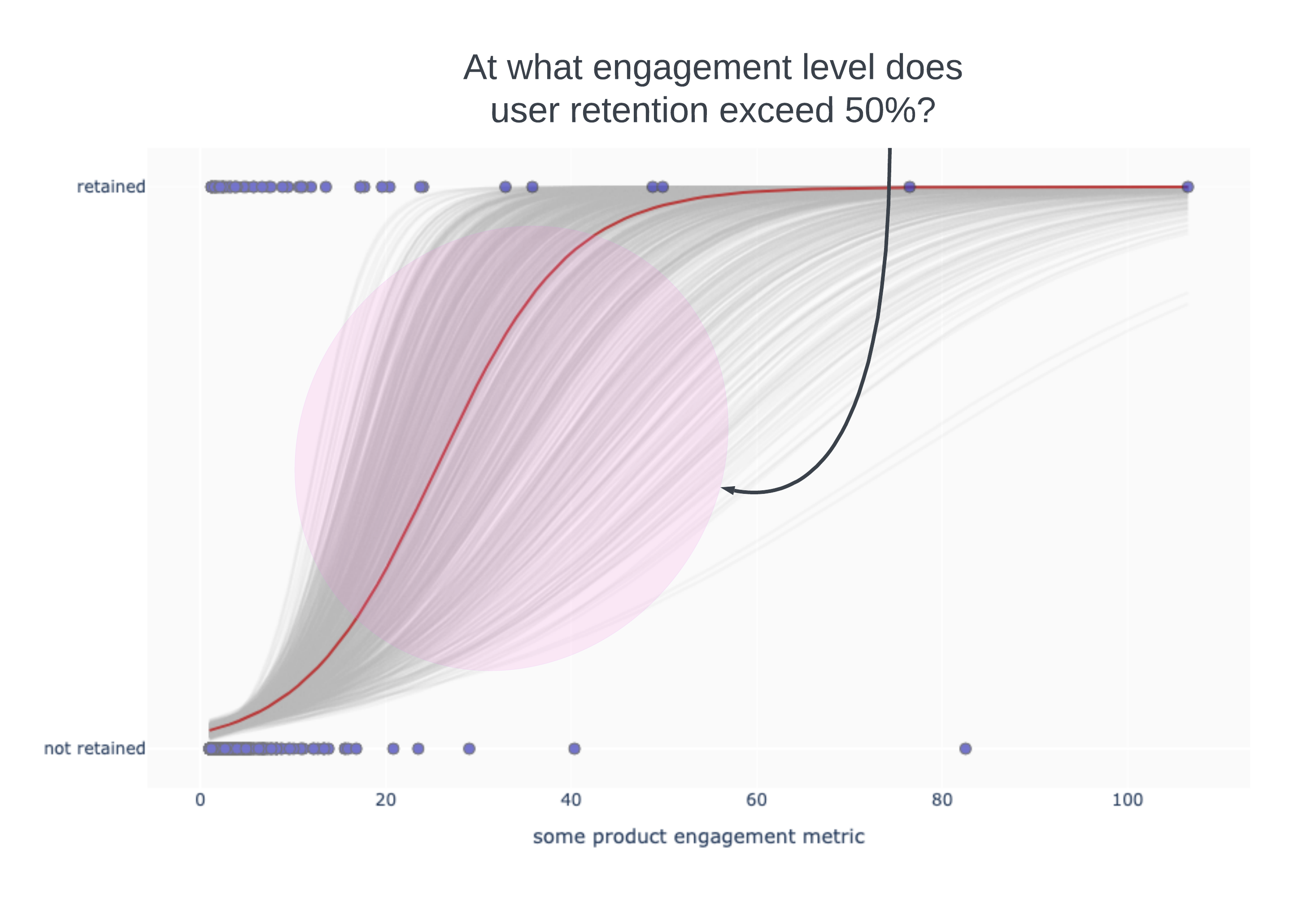
What we shouldn’t confuse from the above is “users are not retaining if they have low engagement”. That is not true. Users are retaining at all levels of engagement. The estimated likelihood of retention grows as engagement increases. We could say something like “Users are likely to have a better than 50% chance of retaining if their engagement level is somewhere between 15 and 55 with the midpoint around an engagement level of 30” (eyeballing the gray curves).
Product teams can use this type of framing far more effectively than single value framing. In the next measurement cycle or for a different cohort, the red line might be slightly to the left of the red line above (meaning that higher retention occurs at a lower engagement level). With single value / single curve reporting, we might think we had an improvement. But in truth this is just noise when we account for uncertainty from the sample sizes.
There’s more to this story and I’ll add more in the coming days, so keep an eye out. But in the meanwhile, the summary here is that if you are giving up on quantitative reads of user engagement, the problem may be a function of uninformative reporting. Having your product managers trained in statistical readouts will help with them make stronger product decisions and separate signal from noise.
As always, reach out if you’d like to learn more about training for your product managers or if you want to start building truly informative product analytics or if you are just curious to learn more.